

FREE DATASHEET
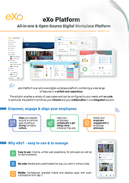
Download the eXo Platform Datasheet and discover all the features and benefits
Here we are with a new « sneak peek » episode.
🥁🥁 This week, we’re excited to announce a new eXo feature eagerly awaited by many customers and users: the organizational chart.
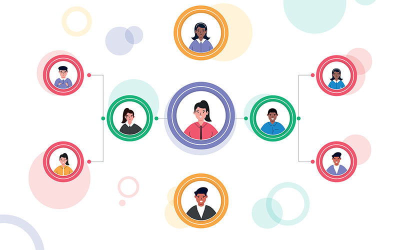
An organization chart is an informative and organizational tool that provides a snapshot at a given moment of the hierarchical, organizational and functional relationships between the people of an organization.
eXo’s new “organizational chart” feature is based on the “manager” field added to the user profile.
This setting can be set manually or imported automatically via a CSV file or AD by an administrator.
As soon as a user defines his manager(s) in his profile, the organizational chart is automatically updated to display this user as part of the team.
An organizational chart contains several levels of information:
The user is at the center.
His managers are displayed above him.
People managed by the user are displayed below him.
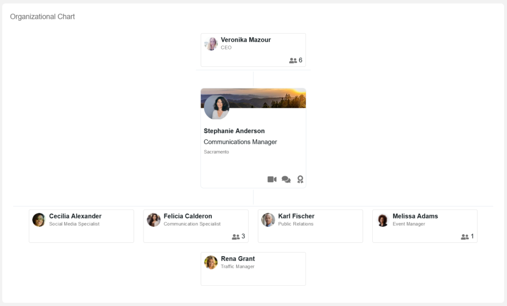
It’s very easy to navigate in the organizational chart: click on the direct manager or a team member card to display the different teams in your organization. Click on the user in the center of the chart to open his profile.
The number at the bottom right of a direct manager or a team member card indicates the number of people the user manages.
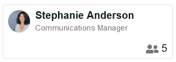
By default, all managers are displayed, and only the first 20 team members. A “see more” button displays all the team.
This new organizational chart is available from :
You can also download the organizational chart in PDF format by clicking on
Only users displayed in the organizational chart will be included in the PDF file.
To create new organizational charts and customize existing ones, you must have « Content Management » rights.
Select the new “organizational chart” application from the list of available components to add it to your page.
You can then customize the application by choosing which user will be displayed at the center of the organizational chart when it opens:
The logged-in user, i.e. you will be displayed at the center of the organizational chart when it opens.
A specific user: a manager, for example, to display a team chart.
Depending on your rights, you can also customize existing charts by choosing the header text and translating it into several languages.
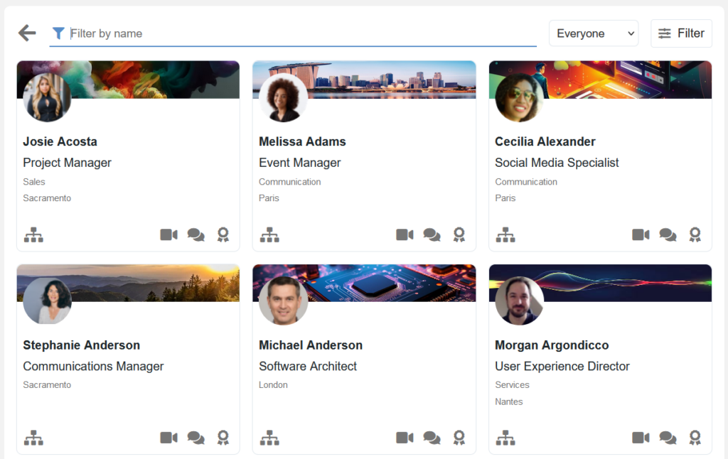
People directory layout has been reworked to provide a more streamlined display, while facilitating access to the new organizational chart feature.
User cards now display the interaction buttons (chat and kudos) in the bottom right-hand corner, and the organizational chart button in the bottom left-hand corner. Moreover, administrators can choose which data is displayed under the user’s name. By default, the position, team and city fields appear.
People directory display is limited to 21 profile cards, and a “see more” button lets you see more users.
Another new feature! Logged-in users now appear in people directory, so you can search for yourself.
Stay tuned for more product updates!
eXo Platform : The Open-Source
Digital Workplace Platform
Download the eXo Platform Datasheet and discover all the features and benefits


Download the eXo Platform Datasheet and discover all the features and benefits
( Your e-mail address will not be published)
I am the Chief Executive Officer of eXo Platform (the open source digital workplace platform), a company that I co-founded while in college and that I came back to after several years in the banking and consulting industry. I blog about modern work, about open-source and sovereignty issues. Occasionally, I also blog about my personal areas of interest, such as personal development, work–life balance, sustainability and gender equality.