- Fares Laroui
- January 19, 2021
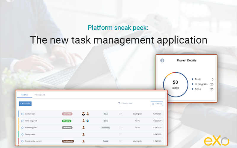
Platform sneak peek: The new task management application
With the release of eXo Platform 6, we aim to improve both the UX and UI of the platform and to give our users a better remote working experience with a variety of new features such as news, the agenda application, the built-in video conferencing functionality, and much more.
In this blog post we will take a deeper look at one of the most ambitious projects our feature teams have been working on for the last couple of months: the new task management application. Although this feature has been available in our previous releases, we wanted to make some improvements to enhance teamwork efficiency and make it more visually appealing and user-friendly.
Content
1. A quick look at the task management application
eXo’s built-in task management application is primarily designed to help teams better manage and collaborate on projects. Users can easily create, schedule, and assign projects and tasks with custom steps tailored to each team’s needs.
The application is fully integrated with other native eXo Platform apps and internal systems such as chat, gamification, notifications, and search. For example, when a task is created or completed the user will receive gamification points. Additionally, users are notified in real time on site or by email when they are assigned a task, or added as coworkers, or when a due date changes or a task is marked as complete.
Visit the documentation to learn how to get started with tasks.
2. What has changed?
A new design
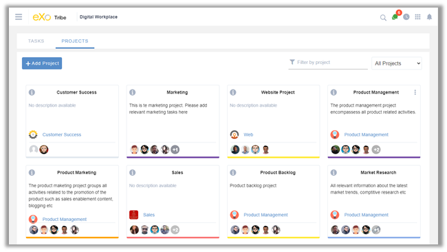
Our team of designers and product specialists has reviewed the task management application, taking into consideration eXo Platform’s new design and UI best practices. Similar to other apps, we concentrated on optimising the screen space and making everything clearer and within easy reach: content, UI elements such as input controls (e.g., buttons, content fields), navigation components (e.g., icons, search fields), and information components (e.g., dialog boxes, tooltips).
A revamped user experience
As for UX, we have restructured the layout of the application, and rearranged content elements and how users can interact with them. In this way, we can help users perform various actions with ease, and prevent errors and mistakes that are often associated with unclear content or lack of instant feedback.
Upon accessing the application, you are given a general view of both your projects and tasks on separate pages. First, the project view is composed of flipping cards. Each card includes the project name, managers’ names, and a brief description, along with options to edit, delete, or clone the project.
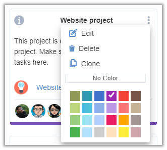
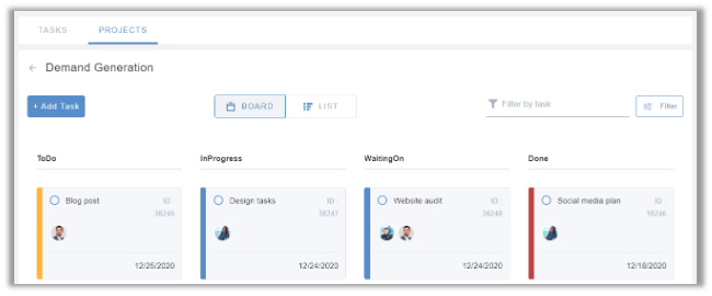
Details are displayed on the back of the card, following customisable steps that you can change according to your needs. For example, you can add, delete, and rename certain tasks. (The default project workflow has four steps: “To do”, “In progress”, “Waiting on”, and “Done”.)
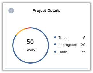
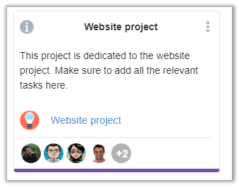
Once you click on a project, you will land on a separate page containing detailed information and a list of tasks that can be viewed as a board or as a list. In both cases, you can easily move tasks along the workflow through a single drag and drop. This way, you won’t have to access the task and update the information manually (although of course you still have that option if you are looking for more personalisation).
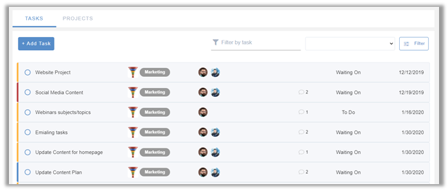
Moving on to tasks, the main view gives you a snapshot of tasks where you are an assignee or a coworker, and any tasks not listed within specific projects. They are displayed as a list. You can easily see the name of the task, the project it belongs to, the due date, members, and a count of comments.
Quick access from the homepage
The newly designed homepage was one of the main additions for eXo Platform 6. It contains multiple content blocks and widgets designed to give users a snapshot of their digital workplace and quickly access their applications.
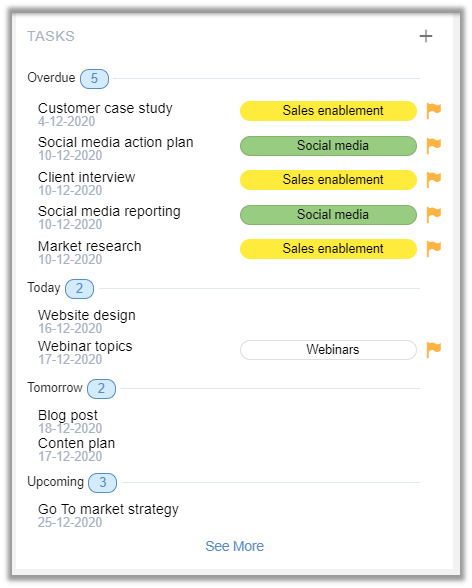
Upon logging in to eXo Platform, you will see a list of tasks within a dedicated content block. The tasks are primarily displayed based on their completion status and due date, with the overdue tasks shown first, followed by upcoming tasks. Additionally, you can quickly create tasks directly from the homepage by simply clicking on the “+” sign.
3. How it works
Now that you know something about the UX and UI changes for the new task management application, let’s discover how you can create, schedule, and manage your first projects and tasks.
Create a project or task
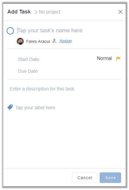
Let’s start with tasks. In the main view of tasks, click on “Add Task”. A drawer will appear. You will be asked to provide information about the project, such as its name, the due date, the assignee and coworkers, priority levels, and a brief description.
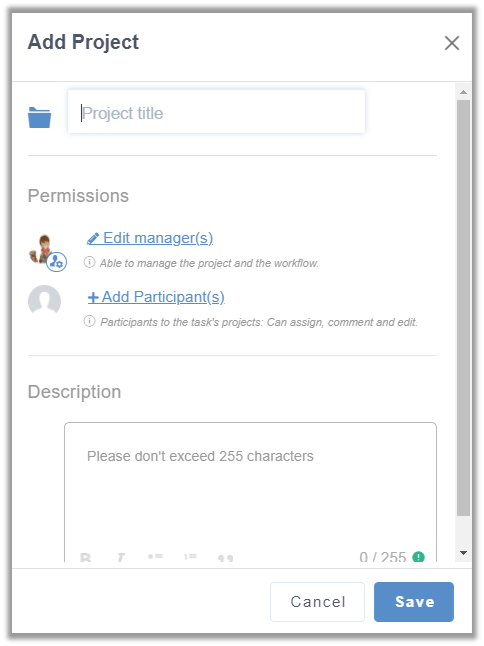
The process is more or less the same for projects. Within the main view, select “Add Project”. You will be directed to a drawer where you can specify the project’s name, add managers and participants, and briefly describe the project.
Edit a task or project
You can edit by clicking directly on the task in question. An edit drawer will appear, where you can change the information you entered during the creation process. You can also view any changes made by colleagues who have permission to edit.
Filter and search
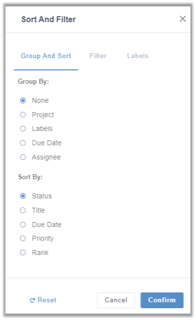
Tasks, whether personal or part of a project, can be grouped and filtered according to multiple criteria. First, you can choose to group tasks according to a common field (Assignee, Labels, due date, etc). You can also sort them by title, priority levels, latest updates, or simply by text contained in their title or description, assignee, and so on.
The task management application will be available as the default app in our upcoming release of eXo Platform 6.1. In the coming weeks we plan to add more improvements, such as mobile support, a Gantt view, and improvements to the editing boards and labels.
You can test drive the task management application on eXo Tribe, where we publish regular updates and listen to feedback. If you would like to know more about the eXo Platform 6 series, we invite you to download this product sheet and watch our webinar.
eXo Platform 6 Free Datasheet
Download the eXo Platform 6 Datasheet and
discover all the features and benefits
discover all the features and benefits
- Tags: eXo
5/5 - (17 votes)
I am a product marketing specialist at eXo. My role is to assist marketing and sales teams in their operations and present our digital workplace solution to the world. I mainly blog about the latest tech trends, digital transformation, internal communication and how to navigate through eXo Platform.
Related posts
- All
- eXo
- Digital workplace
- Employee engagement
- Open source
- Future of work
- Internal communication
- Collaboration
- News
- intranet
- workplace
- Knowledge management
- Employee experience
- Employee productivity
- onboarding
- Employee recognition
- Change management
- Cartoon
- Digital transformation
- Infographic
- Remote work
- Industry trends
- Product News
- Thought leadership
- Tips & Tricks
- Tutorial
- Uncategorized
Leave a Reply
( Your e-mail address will not be published)
Connexion
0 Comments
Commentaires en ligne
Afficher tous les commentaires
