- Fares Laroui
- November 18, 2020
Platform Sneak Peek: The agenda application
Agendas are an important part of our daily and working lives. They have long been one of the most convenient ways to help us manage our time, organise work at a personal or group level, schedule meetings and events, and so on. The need for agendas has only increased during the rise of remote working in recent years (and especially during the COVID-19 pandemic). More businesses are now willing to adopt flexible working arrangements and provide their remote teams with the required software solutions to enhance their overall remote working experience.
Content
At eXo Platform, we have always placed agendas at the heart of our solution. With each previous release, we have tried to bring a number of changes to enhance the user experience and meet the ever-growing expectations and needs of eXo Platform users.
In this blog post we will take a look at the new agenda, why we have decided to bring some improvements, and exactly what has changed.
1. eXo’s agenda in a nutshell
eXo’s built-in agenda application is designed to help users to access and manage various activities, meetings, and events. With its large array of features, it covers a host of use cases ranging from creating and scheduling meetings and organising tasks to importing, exporting, and synchronizing agendas, and more.
The agenda is primarily available for collective use. First, users can access agendas directly from the homepage. There, they can see various activities within their spaces, structure their workloads, and share events with their peers.
Team agendas enable teams to collaborate effectively and to manage projects by making all activities accessible at a central location. All team agendas are displayed in users’ general calendar interface and within specific spaces (depending on the spaces’ settings). Space managers can edit the colors of the agendas. Additionally, users can customise and colour-code their different spaces’ agendas, and choose how and whether or not to display them on their federated calendar app interface.
2. Why we decided to upgrade the agenda application
The release of eXo Platform 6 earlier this year brought a revamped user experience, a new design, and a host of new use cases and applications. Almost every major feature underwent some degree of UX and UI improvements, with the aim of making the platform more visually appealing and user-friendly.
For the agenda application, we wanted to make the experience of creating, scheduling and visualizing events easier and better adapted to the evolving needs of both our clients and community users. We have concentrated on upgrading usability and design on desktop and especially mobile devices, making the app accessible to users wherever they are and thus driving its adoption. Additionally, our dedicated feature team worked extensively on introducing and simplifying use cases, such as the synchronization with third-party calendar apps (Google Calendar and Outlook), seamless integration with built-in video conferencing tools, and more.
3. What has changed?
Similar to other eXo Platform native applications, we have worked on facilitating navigation and redesigning the user interface.
A new design
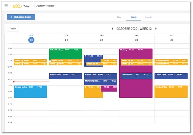
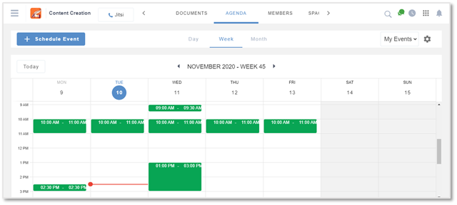
Let’s start with the user interface. The general look and feel of the agenda application has been upgraded to align it with the platform’s overall new design. We have optimised the use of screen space through drawers, making the calendar views (by day, week, or month) clearer and more visually appealing. Additionally, the default Agenda view is improved by the visual indication for non-working times and days, displayed in grey.
Easy navigation and accessibility
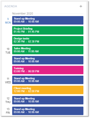
As for the user experience, some improvements have been made to facilitate navigation, accessibility, and a host of other actions. First, the agenda can be accessed directly from the homepage. There, you can find a content block that contains a timeline of your upcoming events starting from the current day, keeping you informed at all times. You can also quickly schedule an event from there, without having to launch the app.
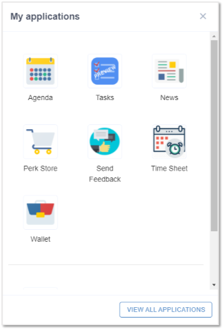
Additionally, you can access the agenda application either from the app launcher on the top bar menu or directly through a space. (It is worth noting that a space agenda view displays only the events of that specific space. You can filter them by “All events” or only those events in which you’re a participant.)
A rich event creation process
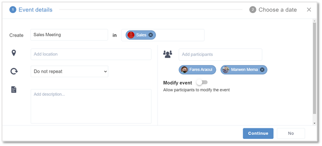
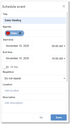
When creating an event, you can select the “Schedule event” button. You will then be asked to provide details of the event and to choose a date.
Here, we have added two new actions. First, when creating periodic events such as daily or weekly meetings, you are now able to create one single event and then choose to repeat it, specifying the time interval that you want (be it daily, weekly, monthly, etc). Second, organisers can grant participants permission to modify the event’s information, add participants, and more.
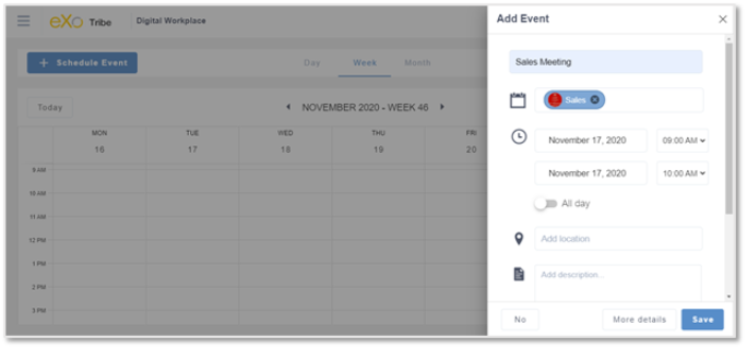
If you want a more straightforward and quick way to schedule your events, you can freely move events within the agenda or simply click on a specific date. A drawer will appear where you can add all the related information.
A revamped mobile experience
UX and UI changes weren’t limited to the desktop, though. The whole mobile experience has been reworked, taking into consideration mobile design best practices and the feedback from our clients and community members.
The emphasis was placed on visibility, ease of use, and user goals. With a smaller screen than on a desktop device, our teams of designers and product specialists had to prioritise which actions to highlight and which to hide, in order to avoid information overload and give users only what they are looking for, and with minimal effort.
For example, as shown on the screenshot below, the agenda view on mobile is displayed as a timeline. In this way, you can see events starting from the selected day, deliberately leaving out any secondary elements that might clutter up the screen space.
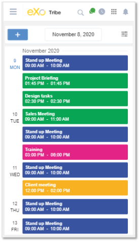
The event creation process has been simplified following the same approach. Upon clicking on the “+” sign, you will be directed to a separate event creation page that contains all the required information.
Connect with remote agendas
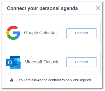
It is now possible to connect your eXo Platform agenda with your remote personal one. All you have to do is to visit the “Settings” page and click on “Connect your personal agenda”. Once you connect your drive, you will be able to view events from third-party agendas (namely Google Calendar and Outlook) and be notified in real time.
Integration with the Jitsi video conferencing tool
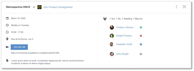
The new agenda application is fully integrated with Jitsi, an open source video conferencing tool that will be natively built-in to our upcoming releases. (There will be more on Jitsi in our next sneak peek post.) The integration allows you to schedule Jitsi meetings and invite members who can join later simply by clicking on “Join Jitsi Call”. In this way the whole meeting can be performed within eXo Platform, eliminating any need to toggle between multiple apps.
The agenda application will be available in our upcoming release, eXo Platform 6.1. Until then, we invite you to test the beta version available on our free community edition here.
eXo Platform 6 Free Datasheet
Download the eXo Platform 6 Datasheet and
discover all the features and benefits
discover all the features and benefits
- Tags: eXo
Rate this post
I am a product marketing specialist at eXo. My role is to assist marketing and sales teams in their operations and present our digital workplace solution to the world. I mainly blog about the latest tech trends, digital transformation, internal communication and how to navigate through eXo Platform.
Related posts
- All
- eXo
- Digital workplace
- Employee engagement
- Open source
- Future of work
- Internal communication
- Collaboration
- News
- intranet
- workplace
- Knowledge management
- Employee experience
- Employee productivity
- onboarding
- Employee recognition
- Change management
- Cartoon
- Digital transformation
- Infographic
- Remote work
- Industry trends
- Product News
- Thought leadership
- Tips & Tricks
- Tutorial
- Uncategorized
Leave a Reply
( Your e-mail address will not be published)
Connexion
0 Comments
Commentaires en ligne
Afficher tous les commentaires
