Platform 4.4 Sneak Peek: Mobile Friendly Chat
This post is the last in a series of articles that introduced some noteworthy improvements to eXo Platform 4.4. Watch this blog for more product news in the upcoming weeks.
We’re wrapping up this collection with a bonus feature that will please mobile users: eXo Chat finally got a mobile friendly facelift.
Since the eXo Chat app was first introduced, we have focused on integrating it with our other apps to make it a first class citizen within eXo Platform. Hence, it is more than a simple text messaging app because eXo Chat supports a number of collaborative workflows, such as capturing tasks, document sharing, capturing meeting notes and exporting them to a wiki, …
However, it was not initially designed with mobile usage in mind and that’s why you couldn’t find the chat icon in the top bar on your smartphone. However, as mobile work collaboration continues to spread, text messaging has become a top demand.
So, after adding some planned enhancements, such as the Participants List and Desktop Notifications, we took a look at the structure of the app and started a subtle redesign that would not break anything, but make it usable on a smartphone.
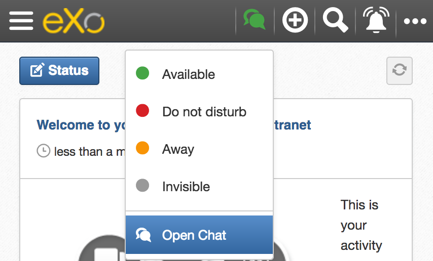
First, you will be able to access the familiar chat icon from the top bar to open the chat app.
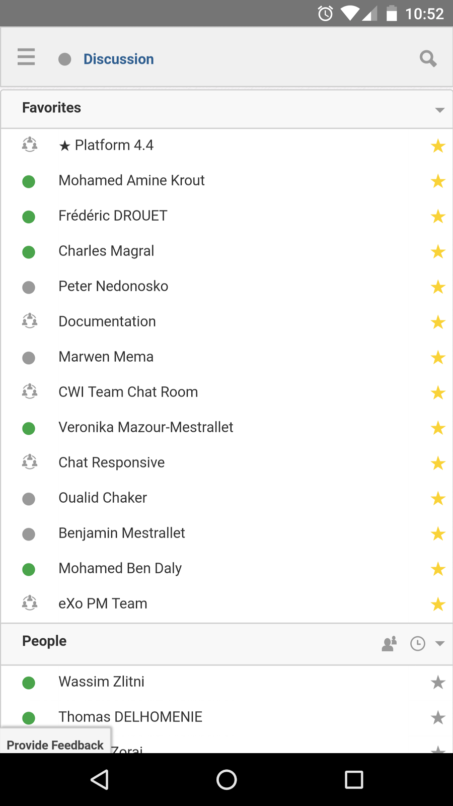
It opens in full screen, replacing the top bar with its own bar and displaying a list of your favorites and other rooms.
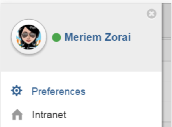
From the top bar, the hamburger icon folds a side panel that lets you go back to the intranet homepage or set your preferences.
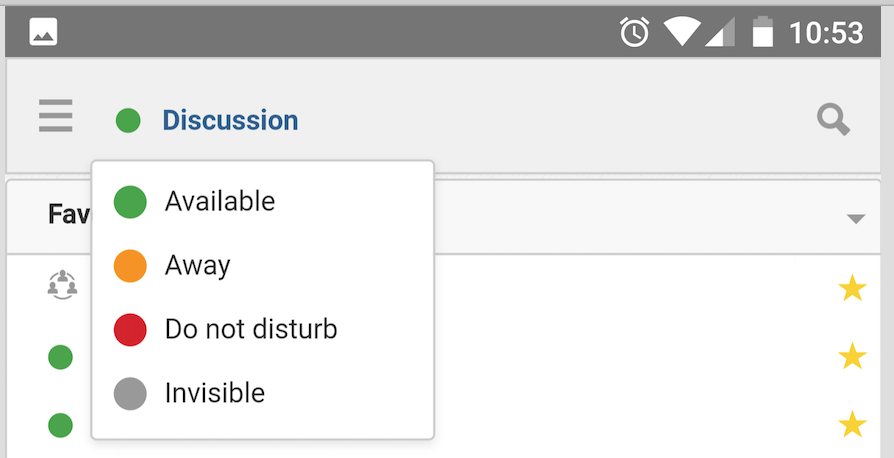
You can also set your presence status from the chat header:
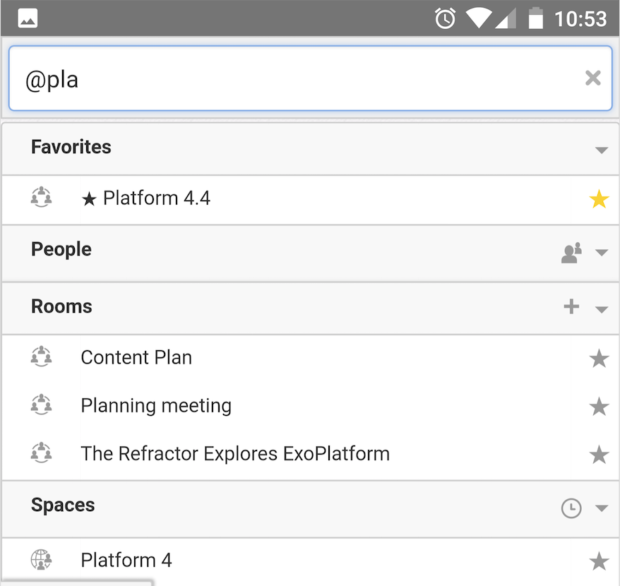
When tapped, the magnifying glass icon reveals a search field that works exactly like on a desktop. Enter anything prefixed with ‘@’ to filter the list of rooms:
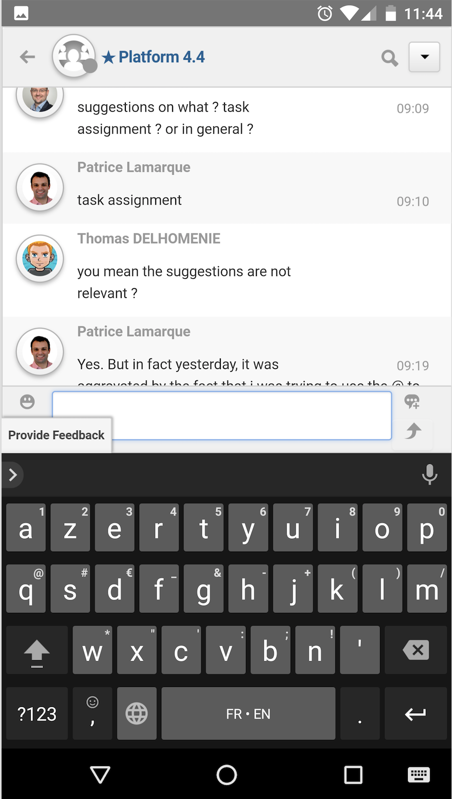
To view a room conversation, simply tap on the room name, and swipe up and down to read back through the conversation. The message input box remains at the bottom as you scroll or open the keyboard, which lets you easily reply to, edit, or quote past messages.
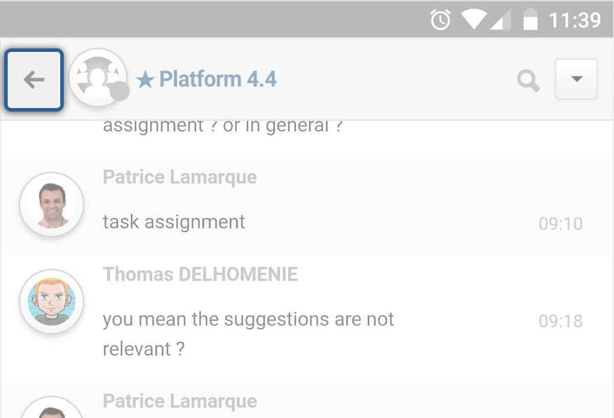
Inside rooms, the hamburger icon is replaced by a back arrow, which is used to list all rooms:
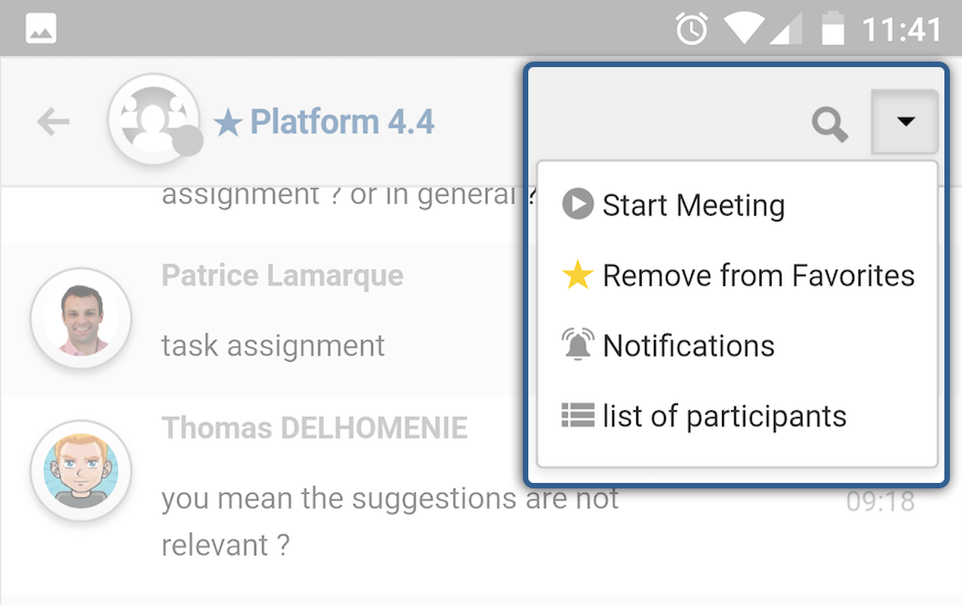
The pulldown room menu gives you access to actions such as notifications and listing participants:
Tell us what you think
This is the first step in bringing eXo Mobile friendly Chat to your smartphones, but we have many more ideas to optimize the mobile chat experience, which we’ll introduce in a future redesign.
As usual, these improvements can be previewed immediately on the Tribe and in the latest milestone of the eXo Platform 4.4 Community Edition. Let us know what you think. We’d love to hear your feedback.
