Make your Platform truly responsive with this great add-on
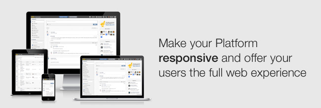
Nowadays, users expect the full web experience on their desktops and phones as well as their tablets.
There are mobile versions of eXo for accessing your site. The design and layout are specifically geared for the small screens of devices such as iPhones and Android smartphones.
However, the mobile version is not the only solution.
Responsive web design is a complementary approach for supporting most devices and screen resolutions. The following add-on is a first step in optimizing the eXo Platform UI and layout depending on the media and the available screen size: eXo Responsive Add-on.
Prerequisites
The add-on requires Platform 4.0.x or 4.1.x.
Installation
The Responsive add-on is available from the eXo Add-ons Repository. You can install it using the eXo Add-ons Manager with one single command line, which downloads and deploys it:
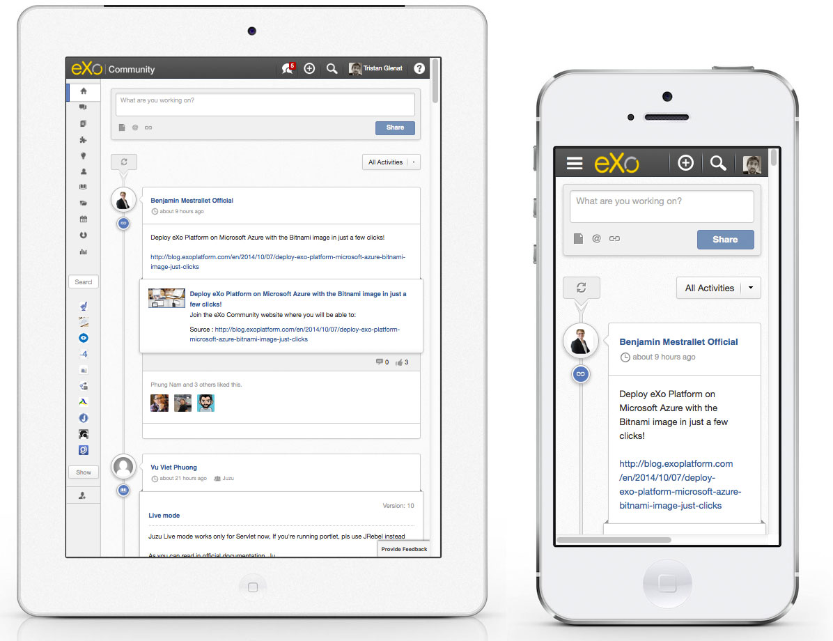
After restarting Tomcat, you will see that your site adapts to devices with a small screen by simply using a smaller browser window. You should see that the responsive layout looks like the screenshot below:
Customizing the responsive behavior
We have tested the responsive portlet mainly with iPads and iPhones, and it only has basic responsive support. If you want to adapt the behavior for additional devices or customize the functionality for the whole site or specific pages, you can do so yourself by following the guide below.
The responsive portlet is written with the Juzu framework and it is placed in the site layout (configured in ) to add responsive capabilities to the whole site.
Start by downloading the source code from https://github.com/exo-addons/responsive-addon and then dig into it.
Adding a Viewport Meta Tag
In , we have implemented a filter to add two viewport meta tags. They are added in :
<meta name="viewport" content="width=device-width, initial-scale=1.0, maximum-scale=1.0, user-scalable=1">
<meta name="apple-mobile-web-app-capable" content="yes">
Customizing the responsive CSS
We use the LESS framework, which is compiled when you build the project with Maven:
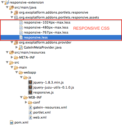
We use media queries ( with and ) to render a site for different devices and screen resolutions. These are the supported screen sizes:
/* Large desktop */
@media (min-width: 1200px) { ... }

/* Portrait tablet to landscape and desktop */
@media (min-width: 768px) and (max-width: 979px) { ... }

/* Landscape phone to portrait tablet */
@media (max-width: 767px) { ... }

/* Landscape phones and down */
@media (max-width: 480px) { ... }
We separated these devices into different LESS files for easier management and all these files will be imported in .
We have added some more elements to that do not exist in the standalone Platform, like this icon:  We control some of the behavior when we resize the web browser using:
To install the extension, first you need to build the project. Run this command on top of the project: . This will generate a ZIP file ().
The simplest way to install this extension is to unzip this file then copy the JAR file into and the WAR file into .
Start your Tomcat instance using:
Note: The current version of the Responsive add-on (1.0.0) will override ; however, with eXo Platform 4.1, the Responsive add-on won’t need to override this XML file anymore because it will use the new dynamic container feature (read the blog post: Super easy guide: inject your portlets wherever you want!). We will rely on dynamic containers in the next release.
Going further
For now, the Responsive add-on only includes basic responsive support. In the future, we’d like to polish it to support the whole site fully with a better user experience.
In parallel, we are also working on a more complete and productized responsive layout feature for eXo Platform. You can follow and participate in the specification here:
https://community.exoplatform.com/portal/g/:spaces:platform_4/platform_4/wiki/Responsive_Layout
If you have any ideas or suggestions, don’t hesitate to post them on the Support Forums.
Resources
https://github.com/exo-addons/responsive-addon
https://community.exoplatform.com/add-ons
Join the eXo tribe by registering for the community and get updates, tutorials, support, and access to the Platform and add-on downloads!

Make the most out of eXo Platform 4
Register to the next webinar and get a complete overview of what you can do with eXo Platform 4. Reserve your seat now!
Brahim Jaouane
I am a Digital Marketing specialist specialized in SEO at eXo Platform. Passionate about new technologies and Digital Marketing. With 10 years' experience, I support companies in their digital communication strategies and implement the tools necessary for their success. My approach combines the use of different traffic acquisition levers and an optimization of the user experience to convert visitors into customers. After various digital experiences in communication agencies as well as in B2B company, I have a wide range of skills and I am able to manage the digital marketing strategy of small and medium-sized companies.