eXo Platform Goes Responsive!
Today, people want information at their fingertips, so in the social era, it means information and convenience.
Work is no longer confined to a desk, reliance on mobile phones and tablets is increasing significantly. They are becoming the primary browsing and computing devices at home and might overtake laptops or desktops in the next few years.
We understand that, without a mobile-friendly layout, the experience is bleak; users expect to see websites automatically adjusted and if that doesn’t happen, the result is usually frustration.
Mobile-friendliness has become a priority, and today, we are happy to announce that Platform 4.3 is meeting expectations.
Let’s see the benefits from the changes.
Sweet and responsive navigation
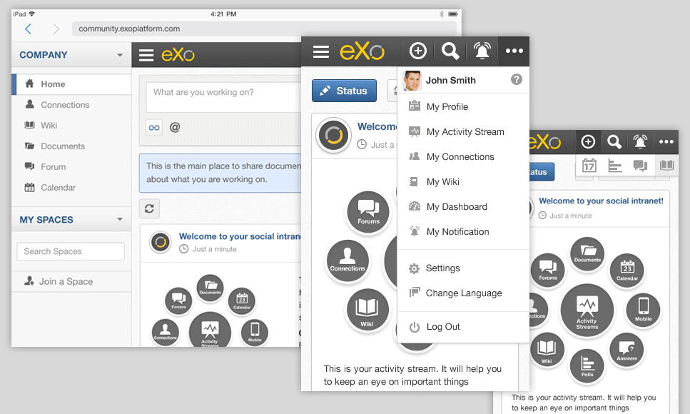
eXo Platform provides rich navigation, allowing you to jump from one application to another within a matter of seconds. In this version, we made sure to reduce the gap between the mobile and desktop experience and focused on providing intuitive and fluid responsive navigation.
To provide you with the best mobile experience, the menu stays in a fixed position at the top of the screen. And to keep it as simple as possible, we decided to limit this top navigation to basic functions (create content, search, notification, and user profile) on small devices.
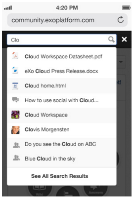
When looking for content, there is no time for beating around the bush. On a tablet or mobile device, simply start typing to get the matching results and find what you need on the go.
Meet the new homepage
Browse your activity stream
Using eXo Platform directly on your phone or tablet is the best way to stay productive when you are not at your desk.
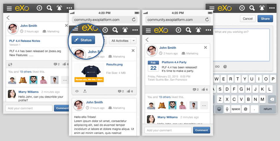
We have redesigned the activity stream to make it easier to contribute, stay in touch, and make decisions.
Stay connected with your colleagues, browse, or like activities on the homepage just as on your desktop version. You can also use the “Status” button, located at the top of your stream, to post an activity.
Simply touch an activity to see see it in detail and to add a comment.
Tailor your homepage
Here, we chose to not display the right application on a mobile screen to maximise the activity stream area as you would see on a tablet. You can easily toggle between applications by a simple touch and keep them on the right side of your screen, or focus only on the activity stream.
Bye, bye, blurry icons!
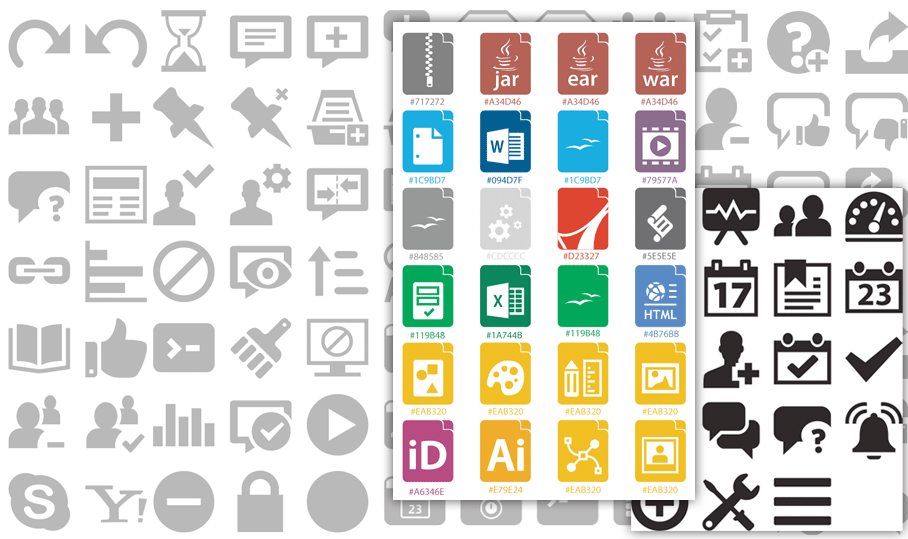
We decided to take the plunge and replace our old and tired icons with sharp and beautiful font icons.
A responsive layout requires icons that scale to your demand, and that was dramatically difficult with images. They don’t respond to screen size and leave you with a pixelated mess when you switch devices.
From now on, the icons will listen to the design to provide a perfect rendering, no matter the device.
With mobile usage in mind, responsiveness is going to remain our priority for a couple of versions, and there is obviously more to come.
We will progressively rework and redesign all screens to provide you with a mobile-friendly and intuitive experience. Stay tuned.
Start using eXo Platform on your mobile device or tablet by downloading the latest preview build and tell us what you think !
Join the eXo tribe by registering for the community and get updates, tutorials, support, and access to the Platform and add-on downloads!
