eXo Platform 4: History of our Platform Designs
When people ask me if I’m satisfied about what I’ve done, my answer is usually: “There’s still room to improve this and that, I don’t like this, I want to do this next, this could be better, and so on.”
I’m the “never satisfied” type of guy. Thus, working for eXo Platform fits me well, because as soon as we release a new version, we’re already working on the next one and thinking about new challenges (stay hungry, stay foolish, we could say).
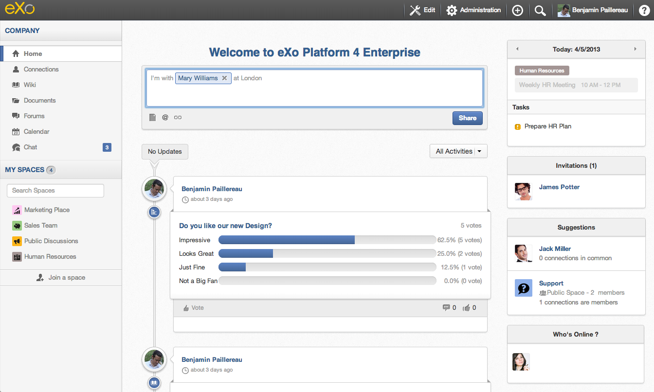
That said, I can also appreciate great accomplishments. And today, I want to talk about one in particular: the overall design of eXo Platform 4. That may sound partisan coming from an eXo employee, but keep in mind I wasn’t involved in the design process—we have a Brand & Design team for that. So the first time I saw Photoshop mockups of what would become Platform 4, I was very excited but I also wondered how this would be rendered in dynamic applications.
Now that Platform 4 is out, I can say: “Damn, they really did a tremendous job!”
It’s not every day that you can say this; you need to appreciate these moments, because not only does it look even better than the mockups, but more than that, it’s using a lot of modern CSS3 tricks. At the end, there’s a minimal use of images, and it’s even perfect on a retina display.
No matter where you look at it, it just looks gorgeous: from the buttons up to the inline popups. And with all this, the Web Design team even managed to have a skin for the old Internet Explorer 8. No gradients or shadows, of course, as it doesn’t support these styles, but still, the Intranet looks fine.
Old Design
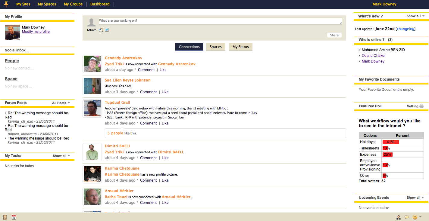
If you go back to the eXo Platform 3 design and take a look at my comments on Jira, you can easily see how I just hated it. The blue and yellow skin was too shiny; there was no inspiration. I wanted to change it immediately.
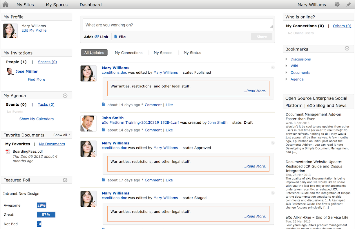
Then, we released eXo Platform 3.5, and that was a huge step forward—I could look at it at least. At the end, the rendering was better but still sad. And not enough work was done on contrast and colors, making it difficult to read.
New Design
Now, if we take a look at the new design, not only don’t you want to go back, but you want your applications to look like this. And I’m writing for partners here: you can use the overall design from Platform 4 in your applications. I actually did it for the chat add-on I’m working on, and I will explain how this can be done in minutes.
One hour to switch, really?
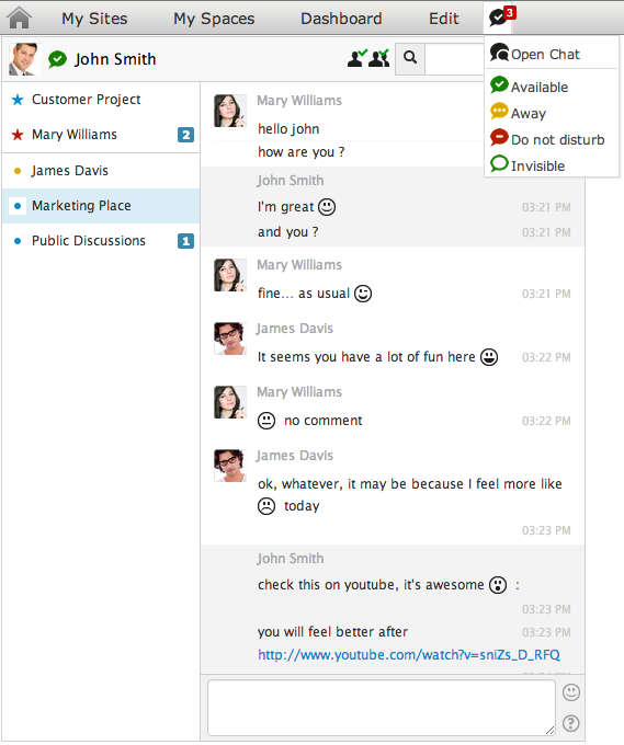
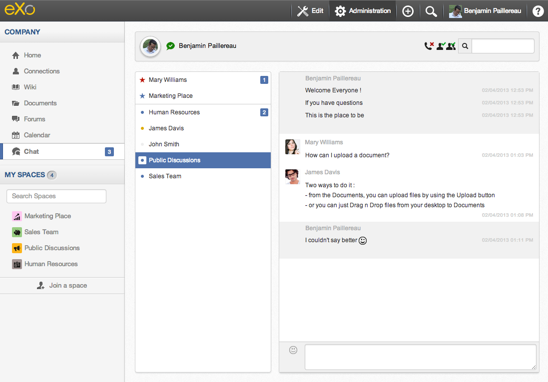
So, if I take the example of the Chat app I developed, how can we switch from this:
To this:
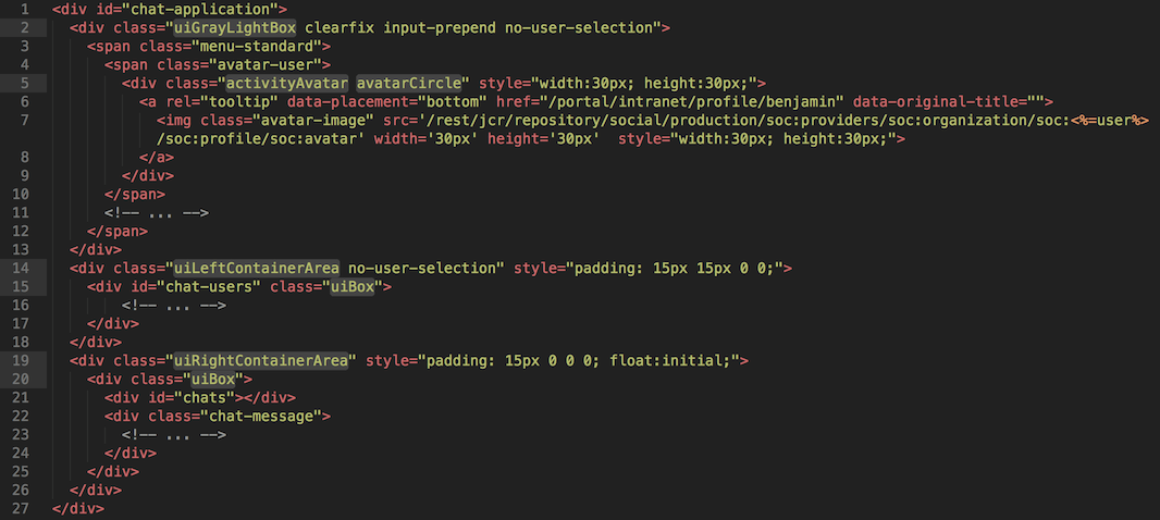
Actually, it’s very easy. It’s just about getting the right UI container. I just modified the html code and maybe a couple specific styles just to make it perfect. The new html code look like this:
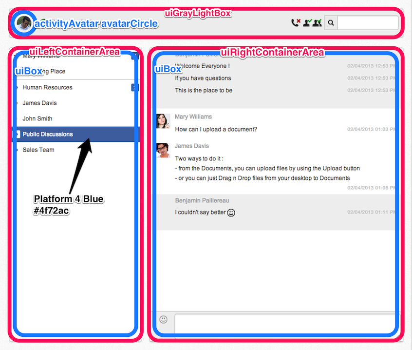
The important CSS classes are :
- : this is the Header one, used in my toolbar
- : I use it for the left panel with list of users/spaces
- : I use it for the right panel with messages
- : it’s the default container in Platform 4 (used inside left and right containers)
- : This is a neat one, I use it to show the avatar in a beautiful circle way.
- : The official Platform 4 Blue color
Now, If you put that in context, it gives:
In my case, it was just a question of replacing some specific classes by the ones used in Platform 4, not a big deal. You can find the entire diff here on github: https://github.com/benjp/chat/commit/1b429c04bd3c1b0074d7eb89748ae6348ea40ba3
In this commit, you will find other edits related mostly to the switch to a new version of JuzuWeb but that’s off topic for today.
What’s Next?
The Design team has produced a real brand, simple and recognizable—one you can use… and one you want to use.
I can assure you, they are tired (very tired). It was a huge amount of work, more than we’ve ever done before, that impacted all teams (Design, Web Design, Cross Product team, All Engineering teams, Marketing, Product). I hope you like it as much as I love it.
« Thanks for watching and stay tuned—more things are coming, Benjamin »
