This post is part of a series of articles that will introduce some noteworthy improvements to eXo Platform. Watch this blog for more product news in the upcoming weeks.
We already addressed in the past few weeks several new features that are coming in our next major update.
In this blog post, we will address instead improvements we are providing in terms of user experience.
Indeed, we embedded a new left menu, eased access to the top bar while scrolling in your activity stream, and also tried to make spaces more recognizable when looking for them.
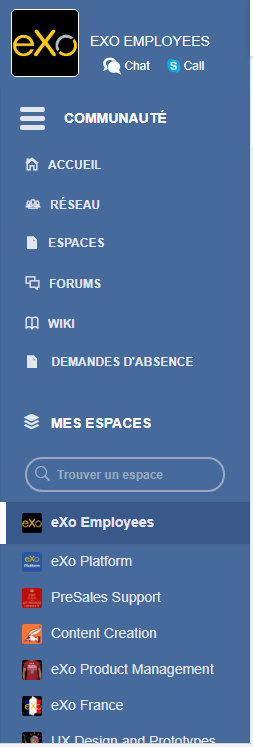
In previous versions, it wasn’t possible for you to see the left menu when you scrolled down looking in your activity stream. The new menu is floating in order for you to reach it whenever it is necessary.
As you can see here, when you scrolled down, the left menu was not visible.
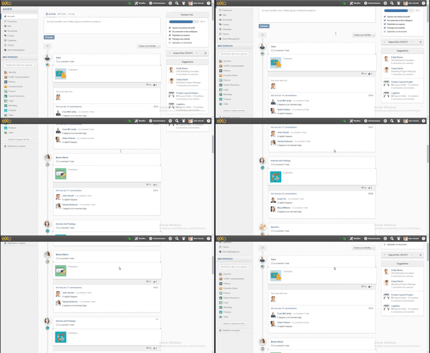
In this new version of eXo Platform, the left menu is always nearby for you to reach.

You can also collapse or expand the menu for a better use of your screen space on desktop.
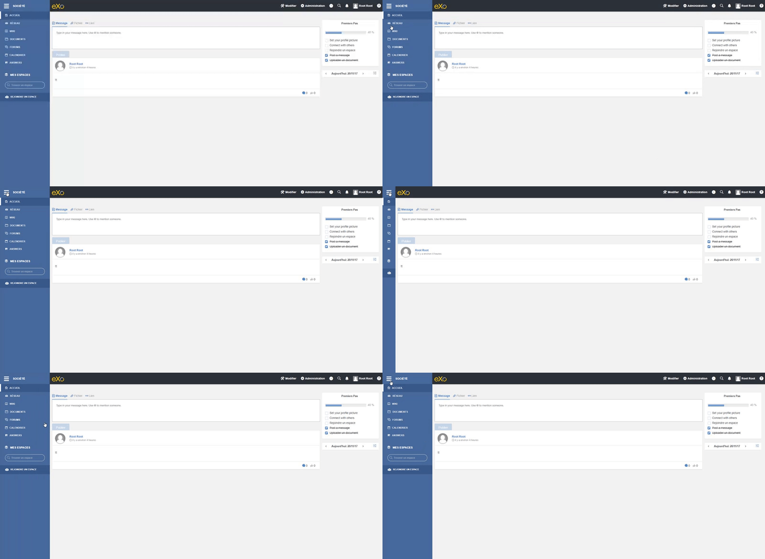
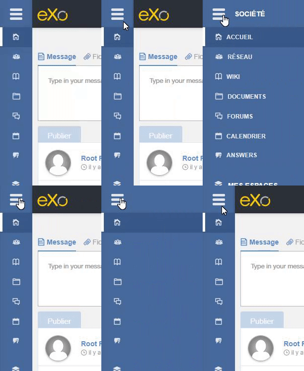
To do so, just a simple click on the menu will make it collapse or expand.
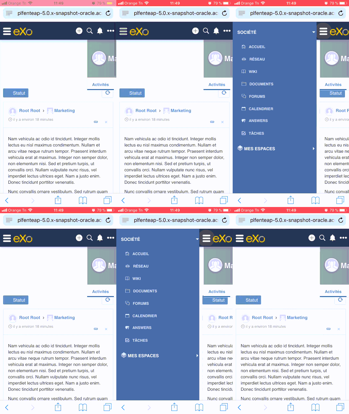
Same goes for the mobile version of eXo Platform.
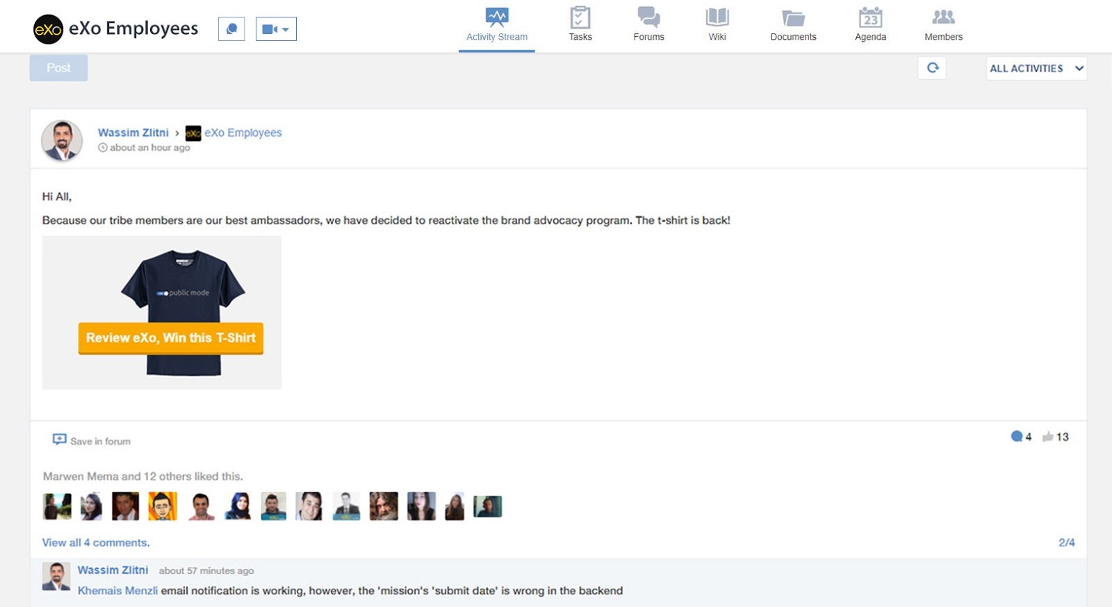
In addition to the new menu, we also made some changes in Spaces. You can now add an image and a banner for your space in order to make it more recognizable.
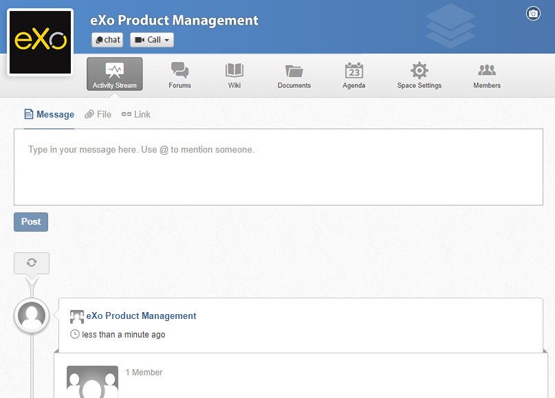
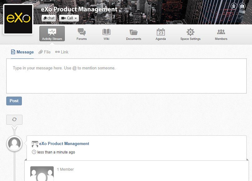
You can also add a picture and a banner from your mobile device.
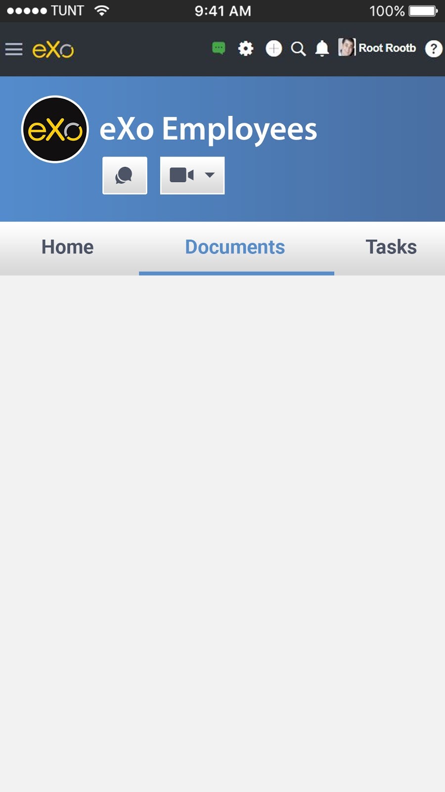
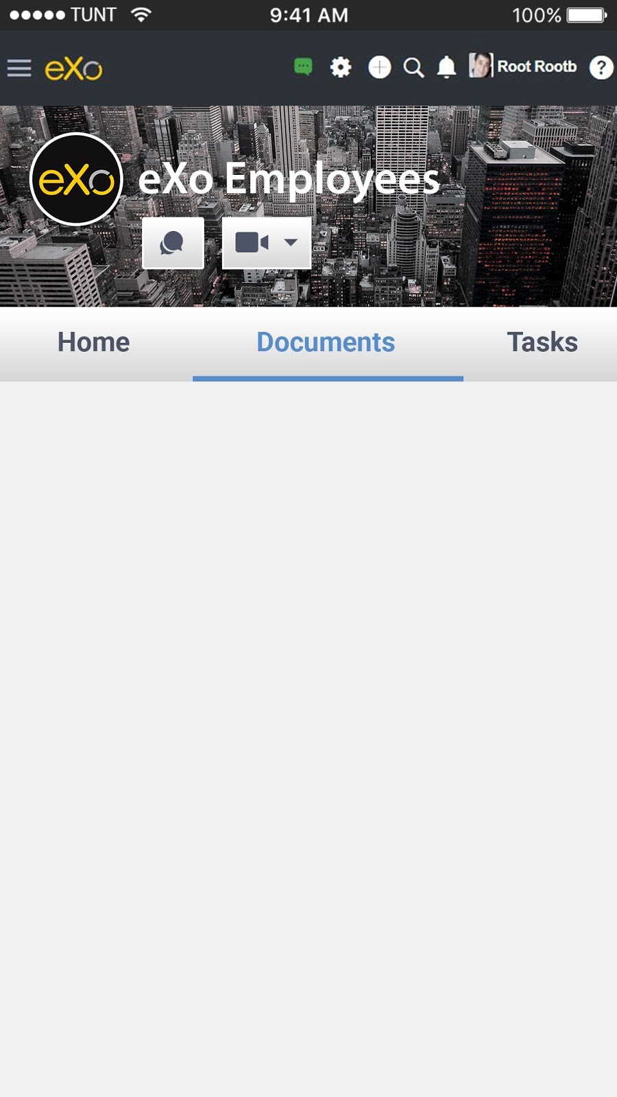
The image you add for your space will be automatically changed into an icon for you to find in your list of spaces on the left menu.
Another new change we added is a new top bar in Spaces. This bar, that contains your usual applications (activities, forum, wiki, documents…) will also be floating. Meaning that when you scroll down through your feed, or your documents, that bar will always be visible for you to reach easily whenever it is necessary.
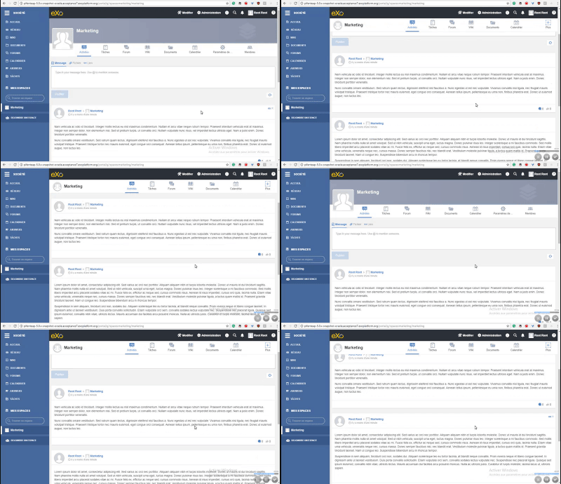
As you can see the top bar stay visible at all times for you to reach whenever it is necessary.
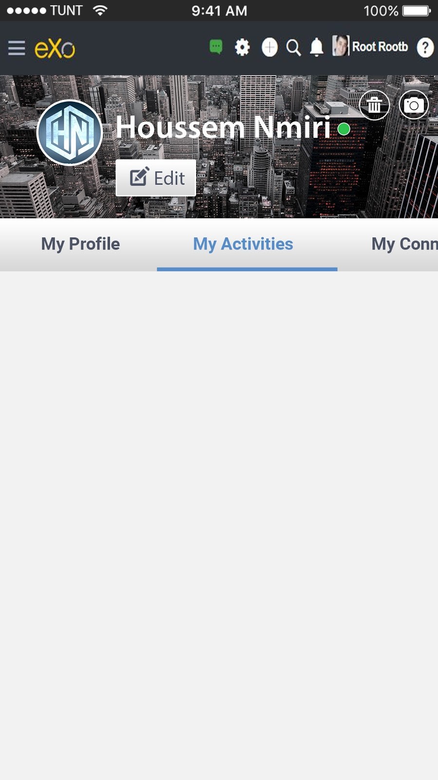
 Not only that but in addition of personalizing your spaces, you can also make your own profile stand out by adding a banner from your desktop.

Or your mobile device.
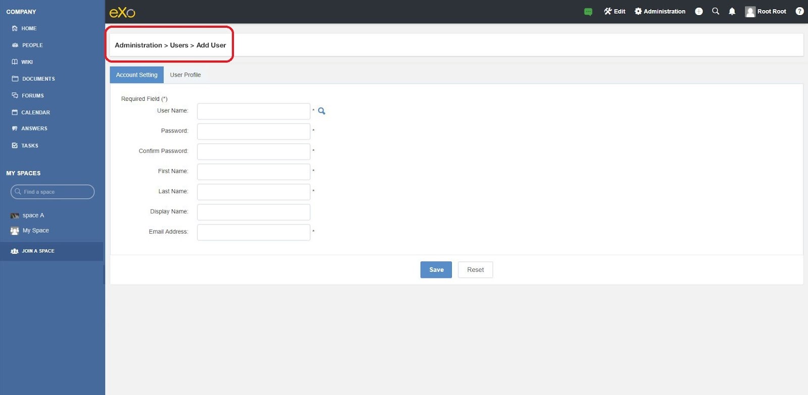
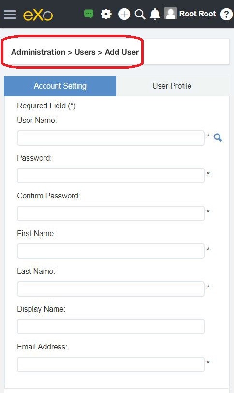
Finally, in order for us to help you navigate more smoothly through the platform, we added breadcrumbs on top of the Administration pages.
Whether on the desktop version.
Or the mobile version.
You can see these improvements now either directly on our our online community site or by installing the latest milestone release of eXo Platform 5.0. Do please leave your comments below or, better still, in the eXo Platform space within the community where you’ll be able to exchange directly with the team that has developed this new feature.
Stay tuned for more product news for eXo Platform !
