A Look at eXo Platform 5 New Design
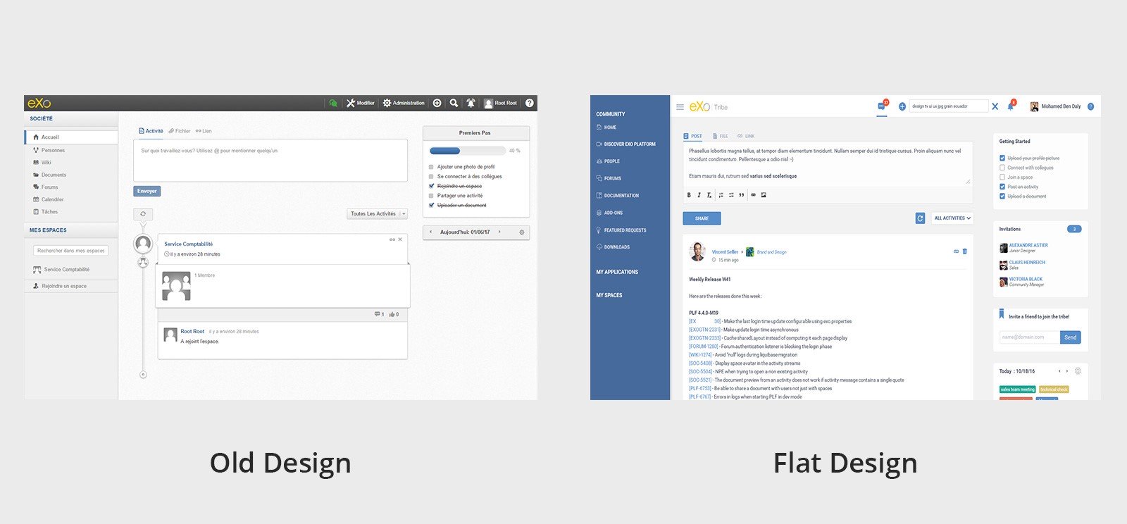
eXo Platform had conserved a specific user interface style since the 4.0 version launch in April of 2013. This design was largely based on skeuomorphic interfaces with its background texture and 3D buttons.
In eXo Platform 5.0, we made a complete graphic redesign, with a shift to a new type of interface called: Flat design.
Shift from Skeuomorphism
eXo Platform 4 was inspired by skeuomorphism design. A skeuomorph is a derivative object that retains ornamental design cues from structures that are inherent to the original.
Another way to define skeuomorph is ‘a physical ornament or design on an object made to resemble another material or technique’. Skeuomorphism is where an object in software mimics its real-world counterpart. The ‘trash can’, for example, is the most recognisable skeuomorphic object. Skeuomorphism began to take off in the 1980s and one of its earliest advocates was Steve Jobs.
The idea was simple: interfaces would be much more intuitive to users if skeuomorphic design was applied. Skeuomorphism, therefore, is design that imitates familiar objects to invoke a sense of familiarity to consumers.
However, skeuomorphism is controversial among designers. Detractors say that it might often feel fake or inauthentic. While skeuomorphism has certainly helped many technological transitions, there are always two sides to the story. Shifting from analogue to digital is one of the greatest technological developments we have ever witnessed. Compared to previous technologies, computers, phones and tablets have become incredibly complex machines. We have condensed a myriad of machines and their functions into small, backlit screens filled with pixels.
Designing intuitive interfaces for such an expansive and abstract technology is arduous. How can you make this realm of richly featured and powerful technology inviting to the average end user? To do so, many UI designers have relied on familiarity, or skeuomorphs.
But skeuomorphism does not come without its disadvantages. For instance, by applying standards that are irrelevant in the digital format, skeuomorphism can limit creativity and functionality. When done right, skeuomorphism will trigger strong associations with real-world counterparts. This is both a strength and a weakness. Indeed, the association is often so strong that it prevents any improvements being made to the design.
Also, skeuomorphic elements can appear inconsistent when combined with less dimensional elements and might make no logical sense. For example, Apple’s Find My Friends app has a background that looks like stitched leather, but this element has no relevance to the functionality of the app. Skeuomorphic elements can take up valuable screen space and rely heavily on images. This can increase the weight of the app, sacrificing its performance for useless embellishments.
Finally, overuse of skeuomorphism can be overwhelming to users by giving them too much to look at. Simple is better when it comes to design. And less is actually a lot more.
This is why we chose flat design, or flat UI, to modernise eXo Platform.
This Enterprise Skin will retain an enterprise tone, while improving readability and presenting a less loaded interface.
So what is Flat Design?
Flat design takes its influence from Swiss-style design. Swiss style emphasises readability, cleanliness and minimalism. Designs from this movement are utilitarian and aim to make efficient use of space (by being flat). One well-known designer from this movement, Josef Muller-Brockmann, revolutionised grid systems. The specificity of his work lies in the fact that he used space in the most efficient way possible. This quest of efficiency in space usage is a most important concept in UI design.
To define flat design, we must define what it is not:
- Flat design is commonly interpreted as a reactionary movement against 3D, skeuomorphic and realistic design styles.
- A fully flat interface does not use any of these styles.
- As the name indicates, flat design is defined by flatness of style: simplifying an interface by removing extra elements such as shadows, textures and gradients that create a 3D look.
- The objective is to have a 2D design without losing any of the functionality to create more digital interfaces.
A good example of flat design is Google’s Material Design framework, where some of the most famous Google icons and UX are reworked as flat versions. In fact, the only elements that take this design beyond strict geometry are the flat icons. This flat UI design embraces the digital interface and makes it look, as we might say, ‘more digital’.
Why we Chose Flat Design?
After we released eXo Platform 4.0, we identified areas that we had improved. Indeed, this version offered what our customers needed to improve their digital collaboration.
However, as we always seek excellency and want to offer a better UX to our customers, we collected information from them to deliver new value in eXo Platform 5.0.
We noticed that we could make the design more user-friendly by using the space more efficiently. This is where flat design comes in. Now it is easier to find whichever functionality or button you need.
We have also improved the platform’s usability. We are aiming to offer a less loaded interface that is easier to read. The shift to flat design has also allowed us to improve loading time. Now collaborators can access and interact with their instance more quickly and efficiently.
Finally, eXo Platform 5.0 is more colourful. The previous version only offered two colours: blue and grey. Now you can choose your own colours from a wider palette and personalise your eXo experience.
 Benefit of our New Flat Design
Our new flat design makes the following improvements:
- Buttons. We have removed the shadows. The focus is now on grids and colours to make the buttons easily identifiable as a clickable element.

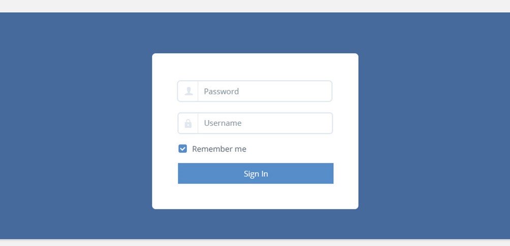
- Forms and shapes : We have added effects (like for the Post button) to create a new modern style with some effects to make it easily identifiable. We have used more consistent shapes to organise content so users can identify and recognise titles, content and controls.
- Colours. We have updated the old, faded grey with a new colour palette, which is easy to navigate and use. For the main colour, we chose our own graphical identity: blue.

- Easy to use. Flat design gives a modern look with a less loaded interface and a faster loading time. It also allows us to produce a more user-friendly (with emphasis on mobile) and more efficient responsive design.
Conclusion
We hope that you will enjoy eXo Platform 5.0, which we have designed to give you the best UX. We always seek to provide the best possible experience and will add improvements when they are needed.
If you have any feedback, please share it with us in our community forums. Stay tuned for more exciting news about the upcoming eXo Platform 5.0 release.

